Brand Identity · Web Design
Basic Capital is the first ever ‘Buy Now Pay Later’ system for retirement, so that everyone can have the chance to build wealth regardless of how much they’re able to save every month. Basic Capital’s mission is to unlock capital ownership for all.

We crafted a brand for Basic Capital that turns complicated finance into something you can see, feel, and trust where building wealth feels less like a privilege and more like a right. It's about democratizing access to financial growth, one smart investment at a time.

If the brand was a person, Basic Capital would sound confident, forward-thinking, and articulate. They know how to listen, and they're easy to talk to, but what we say sounds smart and innovative, always.

Think of the cursor as your first move that blinking line that says "start here." It's like a friendly reminder that you don't need a big pile of cash to kick off your retirement savings. Just like how you click to start typing, it's that simple first click that gets your future money growing. It's our way of saying "hey, anyone can jump in right now."


We're playing with building blocks here, literally. Those square blocks you see aren't just for show, they're like the Legos of wealth-building, representing stability and smart planning. Each block is a piece of the wealth-building puzzle, carefully designed to weather whatever the market throws at it.


Our building blocks aren't just design elements, they're visual metaphors for growth. Each square represents a stepping stone toward wealth, arranged in an upward trajectory that mirrors our users' financial journey.


Here's what we came up with: a set of eye-catching illustrations that brings together movers and shakers from history. We're using these faces to tell Basic Capital's story, showing how we fit into the bigger picture of finance and where we're headed.
We've cooked up the whole package: slick presentation decks, a social media toolkit that pops, various document templates, eye-catching posters, cool merch, and a style that works for both business folks and everyday people.

We have provided 101 slides with various configurations: text, numbers, graphics, and photos. For data visualization, we have included several types of charts and color schemes.

Our editorial system turns financial documents into something people actually want to read. Strong headlines, clear hierarchy, and generous white space work together to make every piece feel both professional and approachable.


We've considered how the product will live in real life, which resulted in a series of mockups with merchandise and printed materials.


We refer to this aspect of the brand's appearance as 'Out of Orbit.' It is employed when Basic Capital is at its boldest and most expressive, whether for out-of-home advertising, social media, or other consumer-facing marketing materials.


While the full product is still in the kitchen, we've rolled out a sneak-peek website that shows off our new brand identity. It's like the trailer before the big movie — giving everyone a taste of what's coming.
Design: Tatiana Leonteva
Brand copywriter: Amelie Pollak
Art direction: Anastasia Sycheva
Abdul Al-Asaad
CEO, Basic Capital
The team was incredible empathetic to our needs, constraints, and preference and thoughtfully executed accordingly on every detail. Product management communication was extremely clear, we knew what they were doing every day and what was the deliverable every week. Full Review
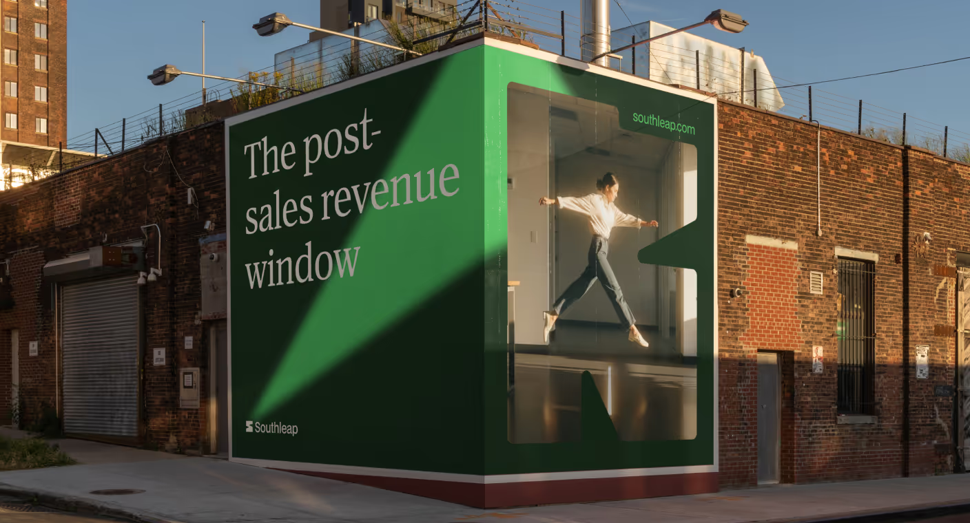
Southleap built a brand that reframes post-sales hiring as a growth advantage

Enduvo rebranded to lead a new category in immersive, no-code learning

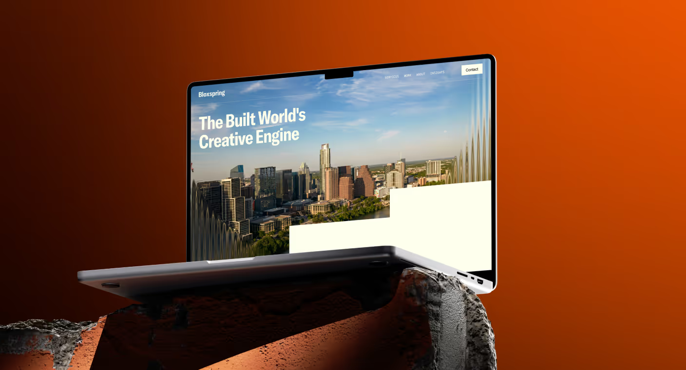
Bloxspring rebranded to grow from PR shop to global content partner

Aimme showed up bold in B2C HR where bad design kills

Lancer built a brand that signals trust, precision and scale for enterprise clients

Noxus turned vision into $1.5M pre-seed three months after rebrand

Glozo launched bold to get seen by talent and clients in a noisy HR market

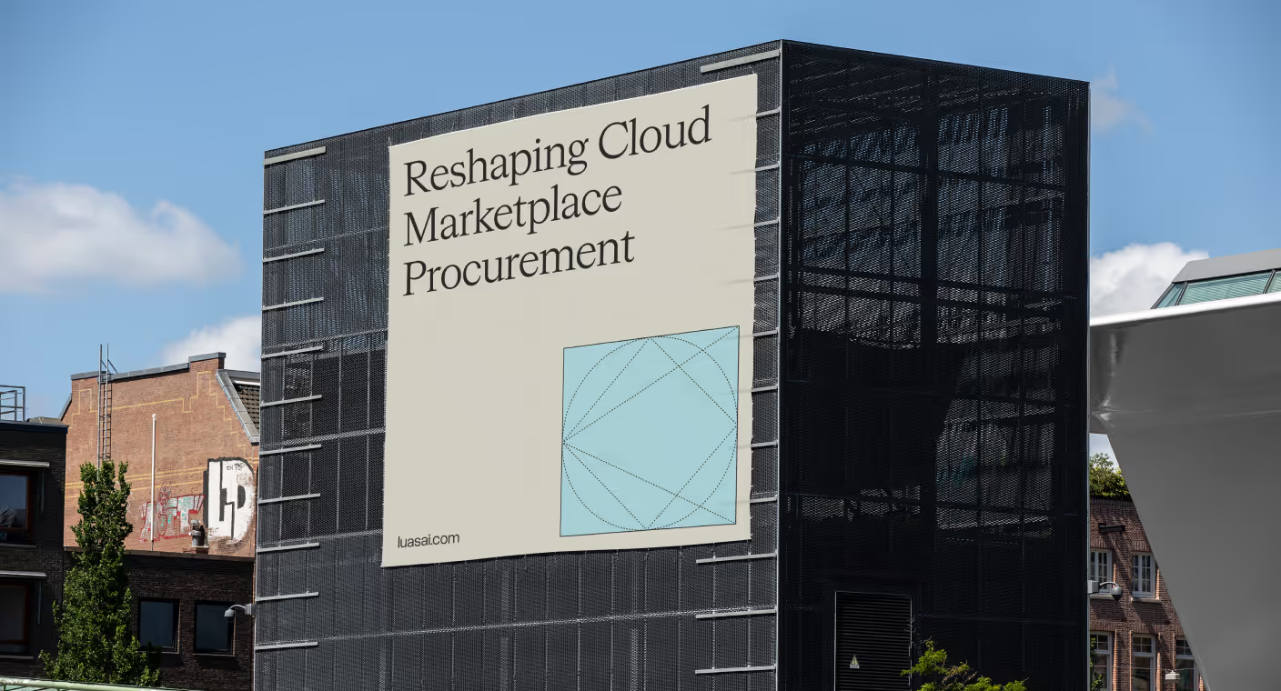
Reshaping Cloud Marketplace Procurement

Branding and website for a Swiss web 3.0 startup to bring a new product to market

Design support for Scade, a no-code AI platform for building multi-modal agents

Visual identity and website design for a healthcare data management company

Redesign project for a healthtech startup

Redesign project for a data startup

Redesign project for a Fintech startup
